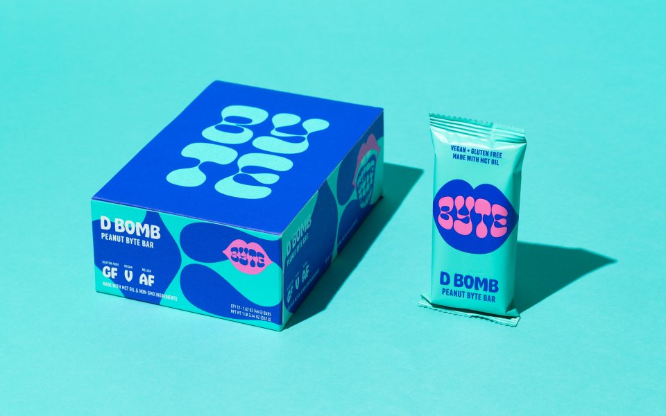
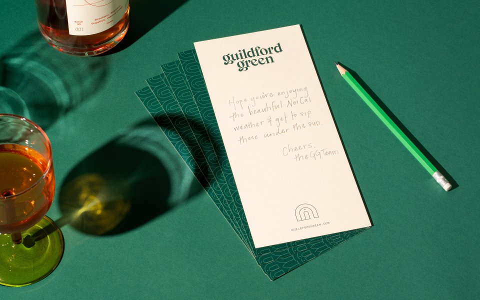
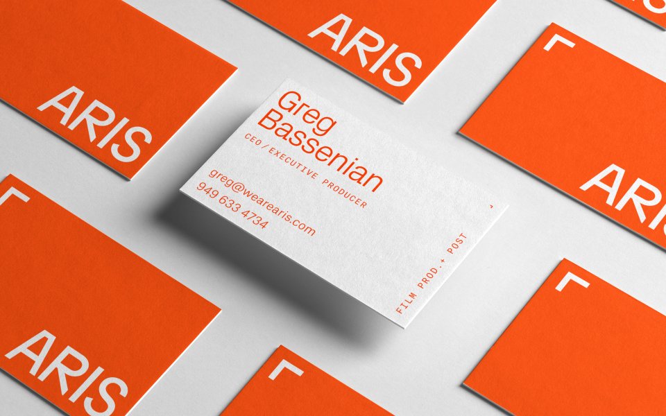
The sans serif is Unica77, a blend of Helvetica and Univers, which was designed to be a “neutral carrier” of information. The serif font is GT Super Text. In the past, our website’s typography has always had a distinct visual character and we found that this visual character often clashed with the brands we were presenting. For example, we’ve previously used a rounded sans serif with a friendly personality as our brand’s primary typeface. When we presented brands such as Huckle & Goose—a brand with a warm, elegant, gentle character—our branding would impart a dissonant visual character that conflicted with our client’s brand. The goal with our current typography is to be as neutral as possible to serve the primary goal of our website: to show off the brands we’ve created.


FYI
Cast Iron Design is now The Office of Ordinary Things. We relocated from Boulder to San Francisco, but otherwise we’re pretty much the same people doing the same things, just a bit more hardcore.