Mad Agriculture
Mad Agriculture
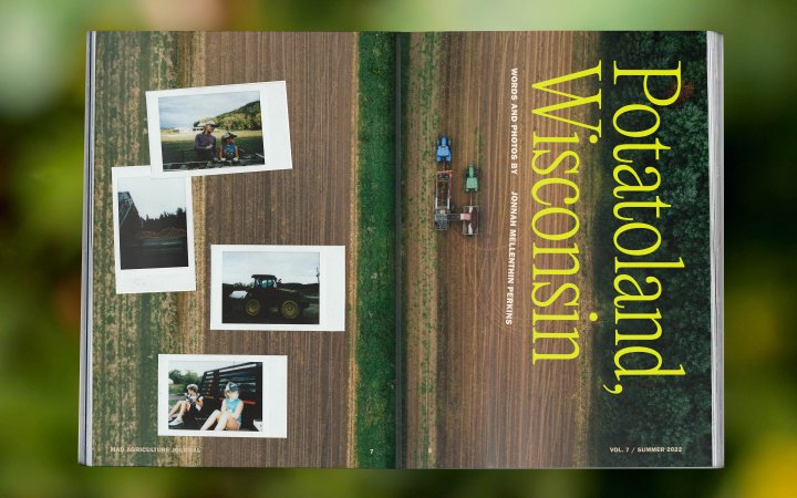
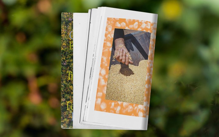
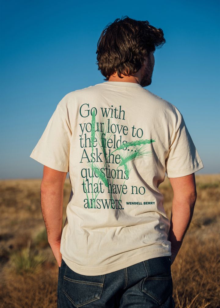
Named after an iconic Wendell Berry poem, Mad Agriculture is at the forefront of the regenerative agriculture revolution. We created a visual ecosystem that’s as “alive, messy, and mutable” as the work they do (and the poets they read).
Scope
Brand Strategy, Brand Identity, Art Direction, Messaging, Motion Graphics, Ecommerce, Web Design, Web DevelopmentCool Points
Nonprofit, Sustainable Practices, Sustainability Education01
Overview
Mad Agriculture is a rhizomatic organization that helps farmers transition to regenerative agriculture. They offer a comprehensive array of services across multiple branches: Mad Capital, Mad Markets, and Mad Lands. They needed a versatile and memorable brand that could simultaneously embody their radical values, bring a breath of fresh air to the farm services sector, and establish trust with diverse clients and stakeholders across the agricultural industry.
Regenerative agriculture is an alternative approach to conventional and industrial agriculture that instead values diversity in all its forms, quality over quantity, interbeing, farmer empowerment, true wealth and more—all driven by the goal of restoring health to the land and the people who walk it.
madagriculture.org
02
Concept
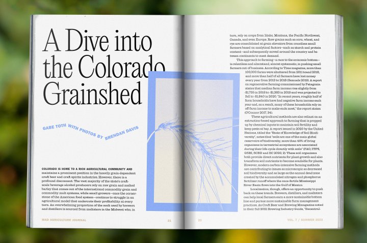
The Mad Agriculture brand channels the gritty, hands-on attitude shared by counterculturalists and farmers alike—where things are slightly off kilter and the unexpected is embraced.
Brand Identity
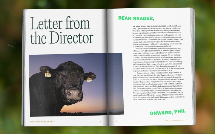
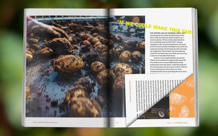
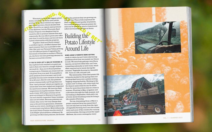
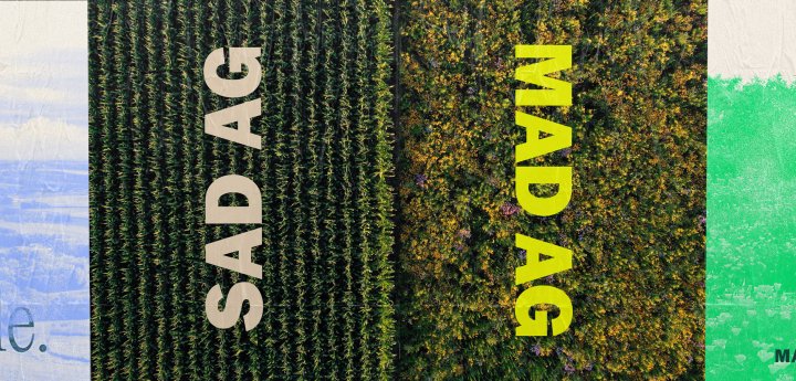
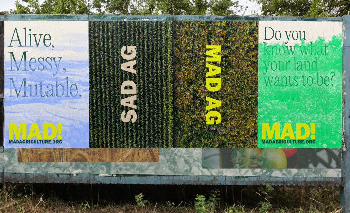
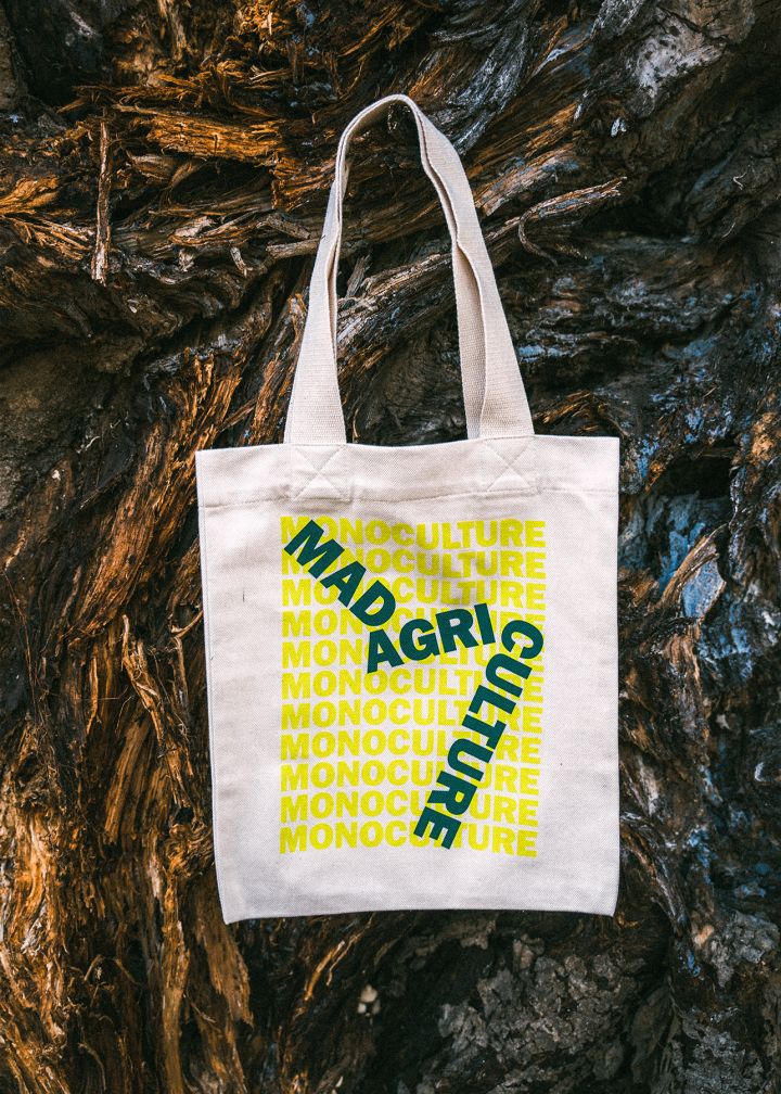
We drew inspiration from visual strategies of the punk, hippie, and labor grassroots countercultural movements: monotone and layered imagery, repetition and rotation, outspoken graphic elements. The concept grew from resonances between these aesthetics and the core values of regenerative agriculture: thriving in liminal and border spaces, activating the edges, as well as the physical presence of prairie strips, hedgerows, and buffer zones in regenerative farm landscapes.
Visit the site
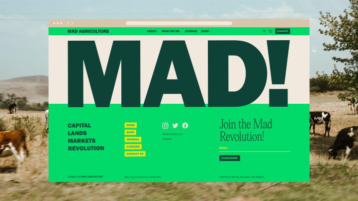
Named after the iconic poem, “The Mad Farmer Liberation Front” by farmer and poet Wendell Berry, the brand is infused with “madness” and wildness at every corner. At its most subtle embodiment, every single element is ever-so-slightly rotated, weaving an intentional, charmingly imperfect character throughout every brand touchpoint.
Strategy
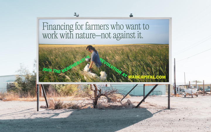
Our strategic guidance included messaging and brand architecture. It was essential that the brand could dial its “madness” up or down depending on the subbrands’ needs. Mad Capital, Mad Ag’s farmer-first loan service, aims to radically disrupt and revolutionize the farm financing space (which is dominated by traditional banks). In order to establish the needed trust and credibility, the visual treatments for Mad Capital land on the more restrained end of the “madness” spectrum.
Logos
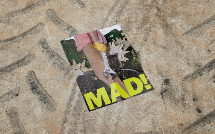
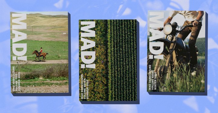
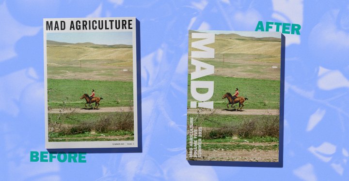
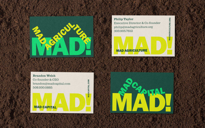
A bold, recognizable MAD! wordmark unites the subbrands as parts of a singular movement.
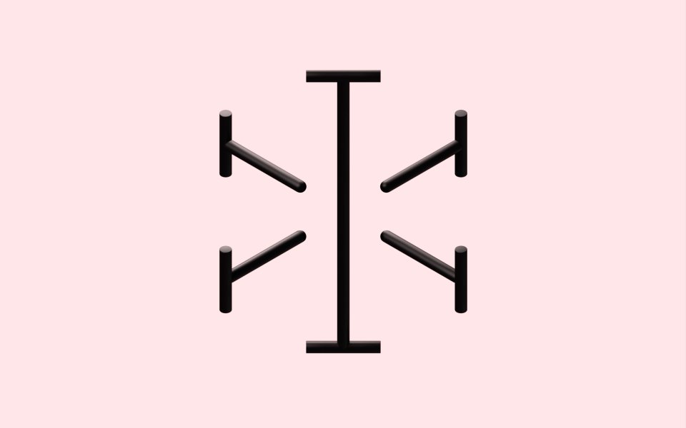
This subbrand “path system” is inspired by staples of regenerative agriculture, such as prairie strips that cut through the land and buck the harsh linearity of conventional monoculture farming as transitional spaces between the cultivated and the wild; by the askance typography of countercultural ephemera; and a literal “activation of the edge” of compositions. The flexible “path system” is echoed throughout the brand’s typography as well.


03
Photography
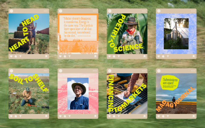
Mad Ag’s photographic style is distinguished from the oft-formulaic tropes of the environmental movement with a simple set of guiding principles.
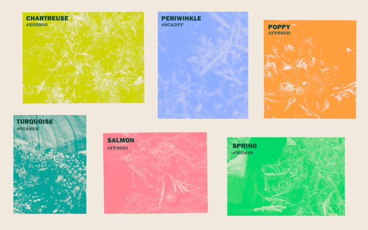
Textural and toned imagery that use a set of unique wildflower-inspired accent colors are reminiscent of countercultural printing methods and add variety, texture, and distinctiveness to a photography-focused brand.
