Sweep
Sweep
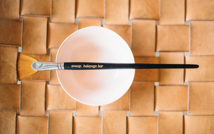
Inspired by the hand-painted process and sun-kissed results of the eco-friendly hair coloring technique, we created a brand identity for Sweep Balayage Bar that captures the salon’s chic yet playful attitude.
Scope
Brand Identity, Brand Strategy, Collateral Design, Illustration, Motion Graphics, SignageCool Points
Sustainable Practices, Woman Founded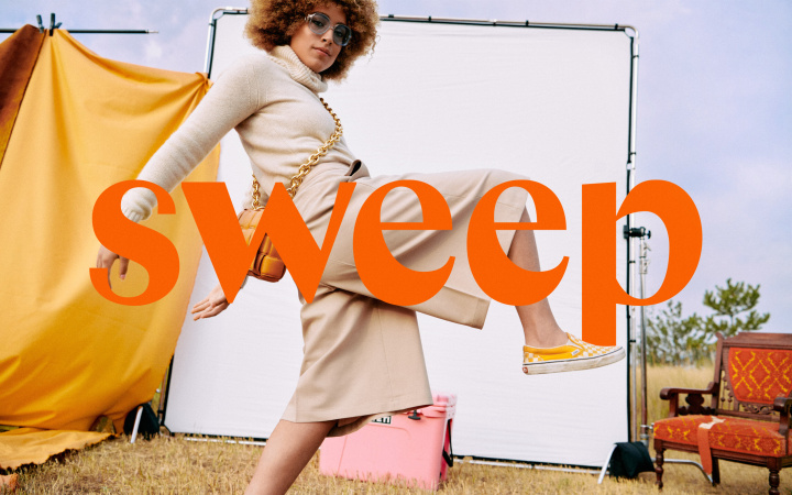
Brand Identity
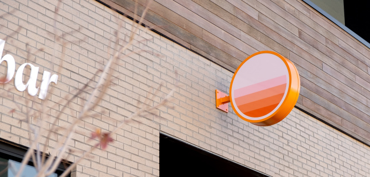
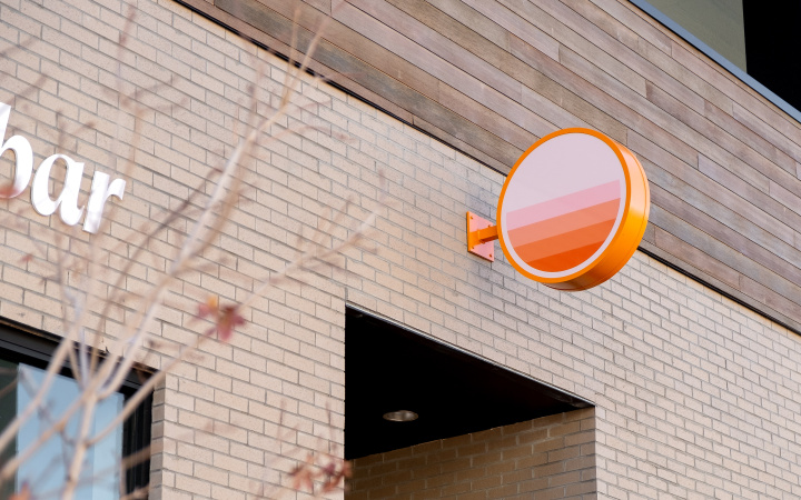
Balayage is a hair coloring technique invented in France and popularized in the 1970s. Whereas conventional foil coloring techniques result in rows of uniform highlights, balayage’s unique hand-painted technique results in randomly placed swipes of color that have a more natural appearance. The chemicals used in the balayage process—gentler on hair as well as the environment—give the hair a more natural, “sun-kissed” look. This inherent quality gave way to the brand’s signature 70s-inspired sunrise motif which is integrated throughout the brand in the form of borders, badges, and illustrations.


Typography
The brand’s primary typeface, Columbia Sans Display, has distinctive italics that harken back to 1970s-era heavy-bottom fonts (see examples) and blend seamlessly with the brand’s retro-modern aesthetic.



Hand-Painted Aesthetic
We extended the balayage painting motif to the brand illustrations and building signage. Instead of using conventional (and environmentally problematic) vinyl window graphics, we commissioned a local sign painter to hand paint the designs, resulting in a perfectly imperfect handmade aesthetic that mirrors the balayage process.

