Isometric
Isometric
Isometric, a UK-based startup, set out to reestablish trust in carbon credits—a market previously rife with opaque claims and overpromising—by taking a scientifically rigorous approach to the monitoring, reporting, and verification of carbon removal. To help set them apart as a trustworthy, expert, and visionary new leader in the climate tech space, we created a brand as rigorous and precise as their work.
Scope
Brand Strategy, Brand IdentityCool Points
Carbon Removal01
Overview
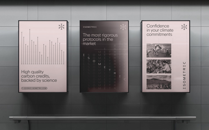
It was essential to set Isometric apart from the vibrant vistas and blue-green palettes typical of the climate tech space, and establish it as a recognizable and legitimate certification authority for carbon removal credits. We determined that the identity’s success would lie in hitting the sweet spot between precision, seriousness, and human warmth. The confident use of a distinctive soft pink balances the exacting structure of the brand’s layout grid, icons, and grayscale photo treatment style.

Logo
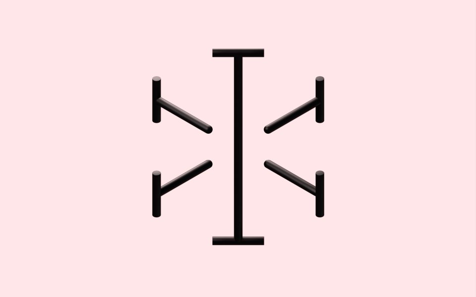
The logo is both a monogram and a representation of measurement. Additional measurement marks rotate outward from the central “I” in isometric space—a nod to the company’s namesake, and the rigor of their certification processes.
Typography
The typography ensures consistency across every aspect of design, visually reflecting Isometric’s scientific rigor. A NASA worm-inspired “S” infuses a subtle playfulness and oblique reference to the company’s position at the vanguard of CDR, further emphasizing its role in helping shape the future of the field.


