Guildford Green
Guildford Green
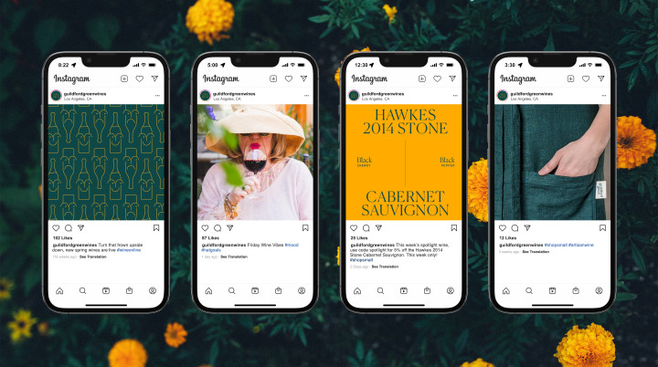
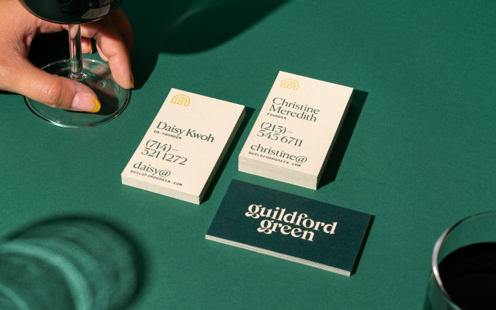
Situating locality and intimacy at the core of their ethos, Guildford Green is a wine merchant that provides a lovingly curated, seasonally rotating selection of wines from small, independent wineries for their community of customers. We crafted a brand that evokes both their playfulness and sophistication, the distinct duality of an excellent bottle of wine.
Scope
Brand Identity, Brand Strategy, Collateral Design, Illustration, Packaging, Print DesignCool Points
Women Founded, Supports Small Businesses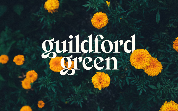
01
Concept
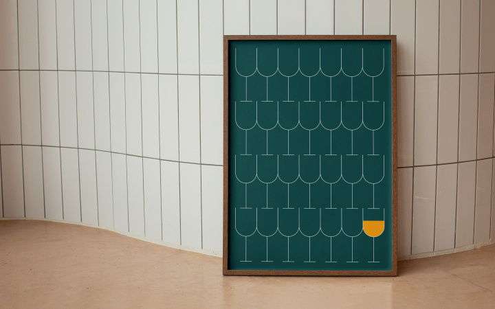
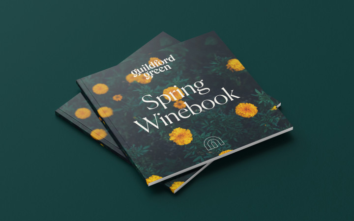
The foundation of the brand draws upon the atmosphere and scenery of Guildford, a pastoral town in the English countryside that is named for its “gilded ford”—a river crossing lined with marigolds. As the eponymous locale of a company focused on regional, family-owned wineries, Guildford provided inspiration for the brand’s color palette and a cue towards elegant, refined typography reminiscent of a stately manor home and rolling fields.
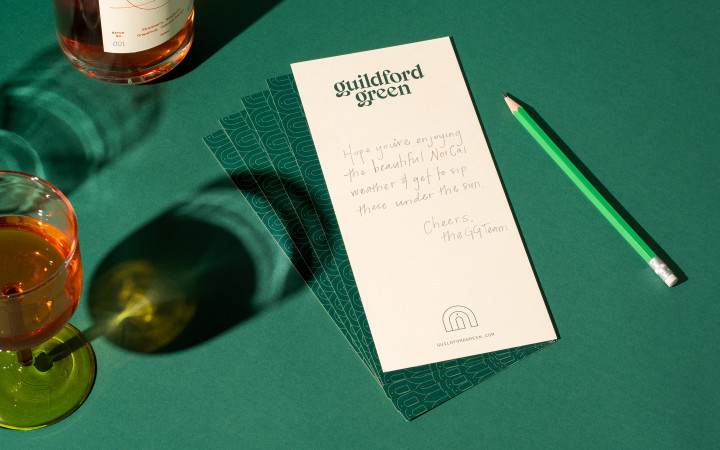
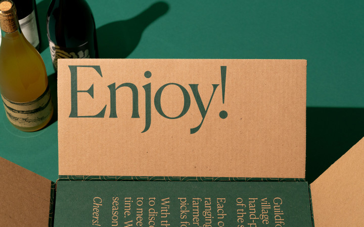
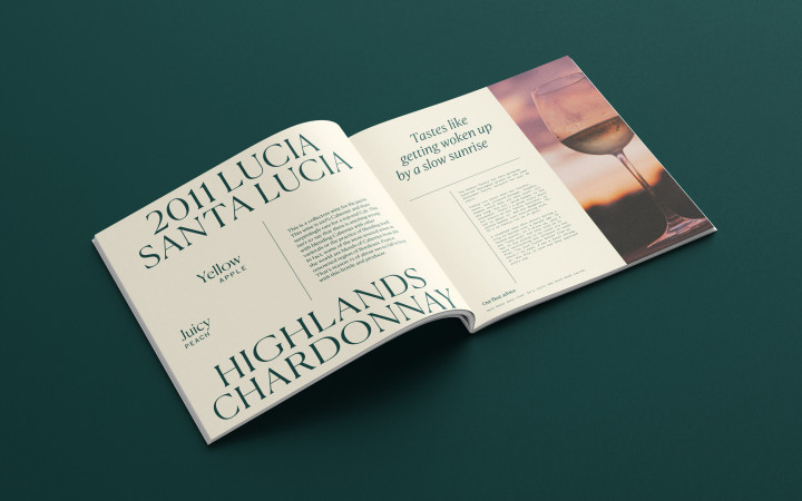
The wordmark is an elegant, bold serif with crisp lines and high legibility. The lowercase g’s curvy, flowing “link and loop” (the bottom half of the character, for the non-typography nerds) is a customized version that draws inspiration from VJ Type’s Voyage to create a more distinctive logotype.

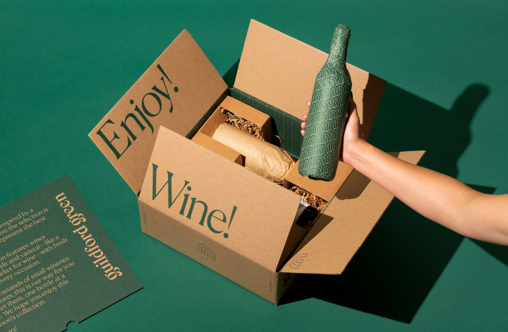

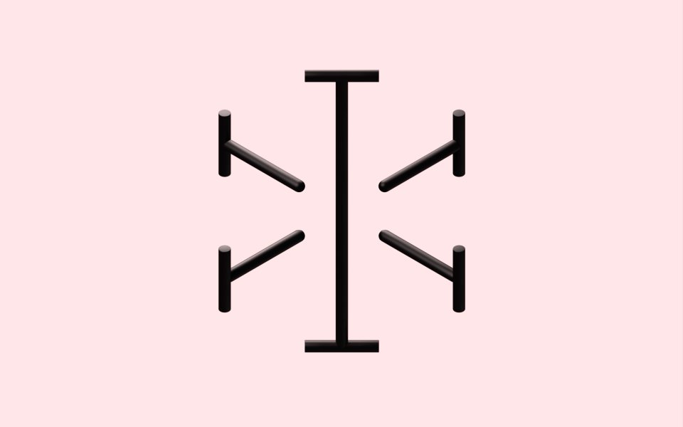
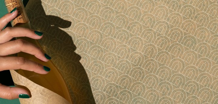
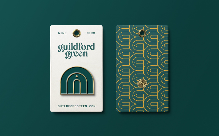
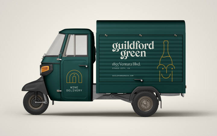
The symbol contains multiple layers of meaning: an abstract archway with a door reminiscent of English architecture that emphasizes the brand’s warmth and hominess; a stylized G upon rotation; an abstract bottle of wine.
02
Mascot
Used somewhat sparingly, Gilly—Guildford Green’s Bialetti-inspired mascot—appears in casual moments of customer engagement. The friendly smile and broad range of expressions bring a little levity to an otherwise elegant, poised, and intentionally restrained brand.

