The Flower Collective
The Flower Collective
The Flower Collective is a cannabis company based in the small mountain town of Nederland, Colorado. After transitioning from medical to recreational cannabis, they tasked us with creating branding and packaging that would help them stand out on the shelf and reflect their company’s values.
Scope
Brand Identity, Copywriting, Illustration, Motion Graphics, Packaging, Photography, Print Design, Web Design, Web DevelopmentCool Points
Eco Packaging
01
Brand Identity
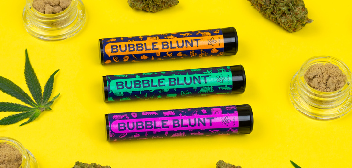
The goal of the brand identity was to create an aesthetic that could quickly grab the attention of timid tourists while also establishing a rich personality for loyal locals. The color system of near-neon accents over deep cobalt was inspired, in part, by ‘60s blacklight posters, giving the packaging an aesthetic influenced by cannabis culture without falling into the same color palettes and visual tropes common with competitors. The bold typography system, custom icons, and creative copywriting help express The Flower Collective’s unique location, product qualities, and sense of humor.
02
Icon System
The Flower Collective’s facilities are located in Nederland, Colorado. Ned is a town of only 1,500 residents nestled in the Rocky Mountains against a large reservoir. It’s known for having a distinct culture and an abundance of character packed into a small area. We played off of their “Ned cred” by creating an icon set where each icon represents a landmark or characteristic of Nederland.


03
Sustainability
In addition to design, we’ve carefully selected materials, processes, and production partners for a multitude of print and promotional items. Special attention is paid to distance since transportation/shipping is a significant contributor to an object’s carbon footprint. Utilizing stateside vendors also helps ensure employees are paid a more reasonable wage (garment workers in developing countries are some of the lowest paid laborers in the world). It’s by no means foolproof, but sourcing as locally as possible is a key component of sustainable systems thinking. Although individually packaged products are inherently unsustainable, The Flower Collective is taking marked steps in the right direction.
04
Packaging


Sustainability
Along with the carbon footprint of the materials used in a package, weight is one of the most important considerations when designing sustainable packaging. For premium products, a rigid box (think iPhone packaging) is the de facto substrate choice. Rigid boxes are problematic as they add a substantial amount of weight. For The Flower Collective, we worked creatively with a folding carton (think Advil packaging) to give the premium feel of a rigid box without the added weight. For the adhesive closure label, we used a facestock composed of 100% postconsumer recycled fibers. For the label’s release liner (the coated paper that protects the adhesive, which is almost always not recyclable and therefore destined for the landfill) we specified a recyclable release liner made of unbleached kraft paper.
Concentrate Box Concentrate Box
Neenah Environment, Folding Board (100 PC White, 24pt Cover)
100% postconsumer waste (PCW) recycled fibers
Process Chlorine Free (PCF)
Manufactured carbon neutral (RECs certified by Green-e®)
FSC® Certified (Forest Stewardship Council™)
Manufactured in the USA
Letterpress printed with rubber-based inks
Label – Facestock Label – Facestock
Green Bay Packaging – Domaine Eco 1 (60#, 89 g/m²)
100% postconsumer waste (PCW) recycled fibers
Process Chlorine Free (PCF)
FSC® Certified (Forest Stewardship Council™)
Manufactured in the USA
Flexo printed with water-based inks in Colorado, USA
Label – Release Liner Label – Release Liner
Green Bay Packaging – Unbleached Kraft Liner (39#, 64 g/m²)
Recyclable with corrugated cardboard
Manufactured in the USA
05
Copywriting
Creative copywriting was a point of emphasis, injected into nearly every touchpoint. The basic guidelines are to keep things short, avoid negativity, and draw a little inspiration from a cannabis-induced state of mind, with the hope of inducing a smile, smirk, laugh, or eye roll.


We created a tagline which plays off of the fact that Nederland is heavily forested and that “trees” is internet slang for cannabis.


The copy proved successful when a customer’s photo of the blunt’s suggested activity reached the top of Reddit’s front page with over 45,000 upvotes and 1,100 comments.

I love this world. Even with all its f*ckery. This. This right here. Gold.
Reddit user “LittleMoePeep”
06
Swag


Sustainable Packaging Tape
Water activated tape (WAT) is the best choice for commercial carton shipping due to its exceptionally strong bond. Since it’s made of paper, it can be recycled along with the corrugated box it’s adhered to. (Plastic tape must be separated from the slurry in the recycling process and either put in a landfill or incinerated). For The Flower Collective, we specified non-reinforced WAT, which has a cleaner look and avoids the use of fiberglass. Typically WAT is reinforced with fiberglass strands which strengthen the tape; since TFC isn’t shipping heavy materials, reinforced WAT wasn’t necessary.


07
Website


