CarbonPlan
CarbonPlan
In a field rife with overwhelmingly complex data and lofty solutions, CarbonPlan creates tools and resources to “improve the transparency and scientific integrity of climate solutions.” We developed a brand optimized for data visualization and comprehension, with a hint of cheeky geek.
Scope
Brand Identity, Data Visualization, Web Design, MessagingCool Points
Nonprofit, Carbon Removal01
Brand Identity
A circle forms the heart of the brand identity, connoting core parts of the identity from the smallest to the largest of scales: molecules, the carbon cycle, the globe.
Logos
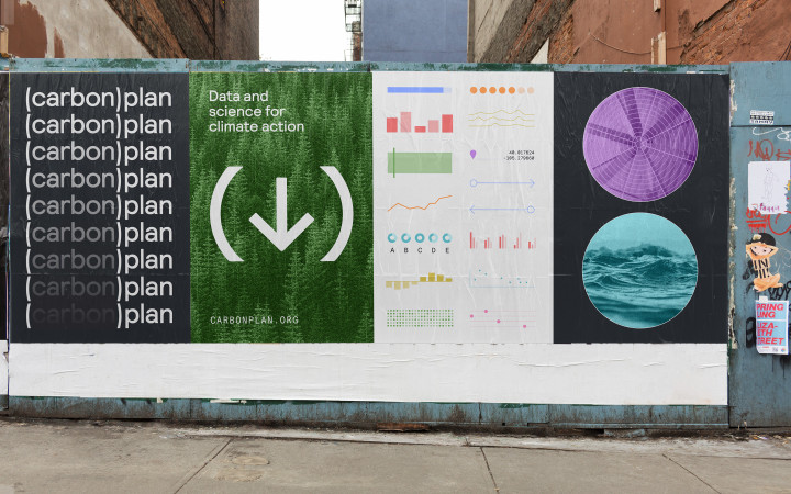
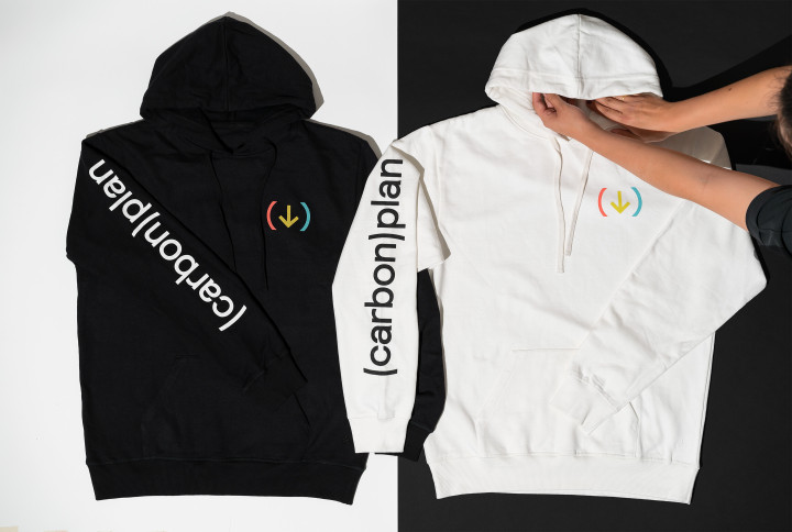
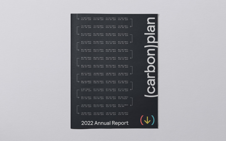
The wordmark is a stylization of CarbonPlan’s name through the insertion of parentheses, which reflect the act of carbon sequestration (aka carbon removal). They also allude to mathematical notation, emphasizing the organization’s data-driven focus. The custom parentheses are drawn to form the sides of a perfect circle, ensuring geometry is incorporated at all levels of the brand. For the symbol, the organization name is replaced with a down arrow to represent the goal of reducing carbon in the atmosphere.

Color Palette
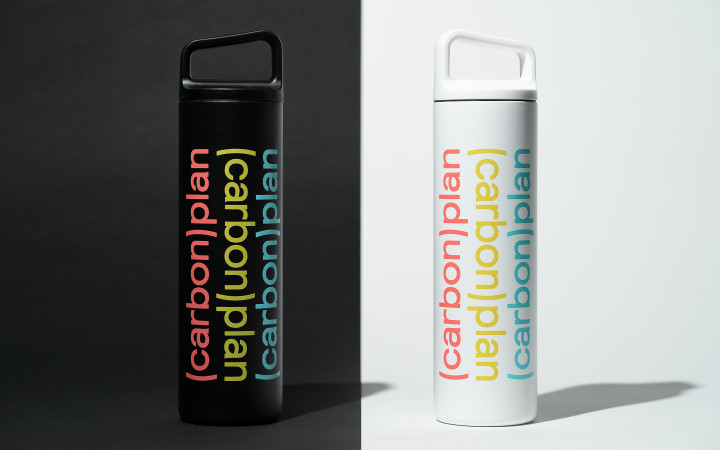
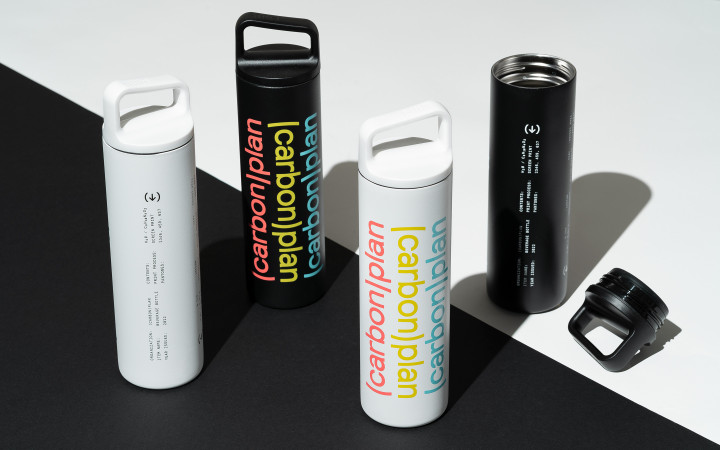
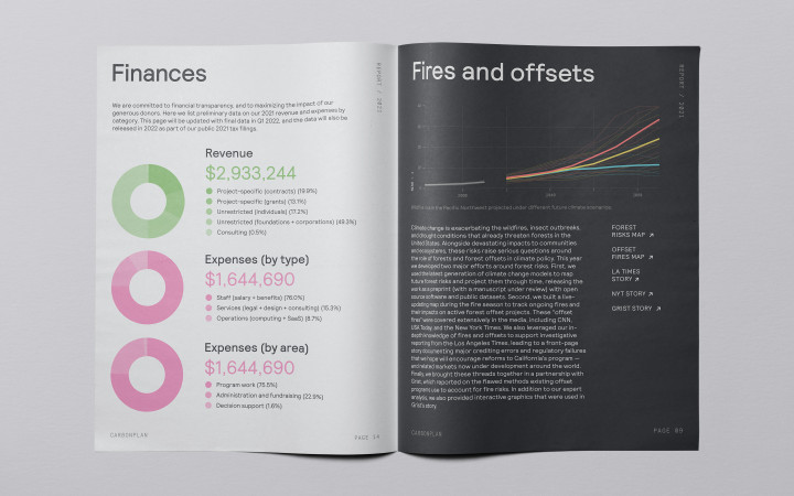
A large color palette was essential for effective and comprehensible infographics. The selected colors also needed to work on both dark and light backgrounds; CarbonPlan knew they would have a variety of design applications with both, including a dark/light toggle for the site.

02
Messaging
Alongside the serious nature of their content, there is a deliberate sense of humor and pervasive warmth in CarbonPlan’s organizational voice (and an infectious, nerdy enthusiasm for rigorous science and detailed data).
Metadata
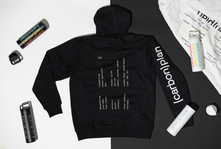
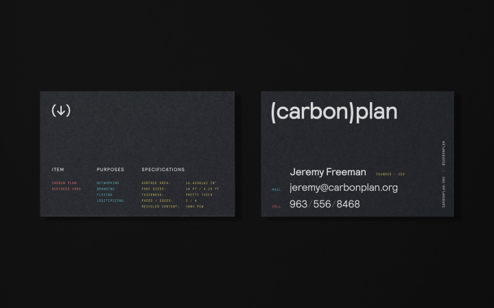
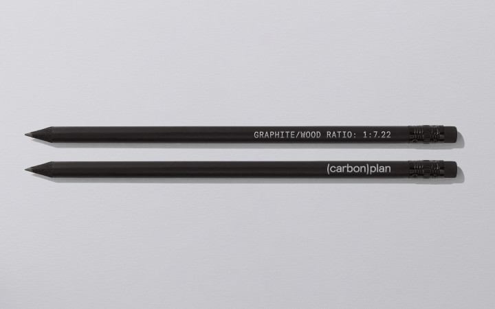
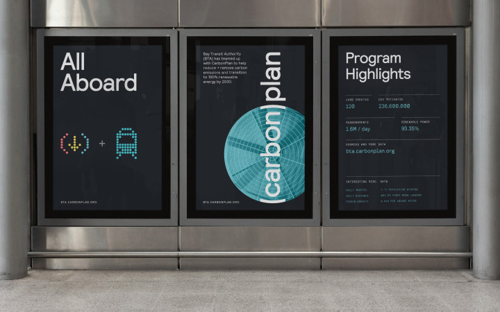
To bring levity to the brand, we infused it with unusual, unexpected, and often unnecessary “metadata.” This ranges from an innocuous element measured with superfluous precision (like the cursor coordinates displayed on the website), to a commonly quantified parameter with an odd unit of measurement (like the thickness of a business card being identified only as “pretty thick”).
Data Visualization System
From the outset, the brand was purpose-built for CarbonPlan’s products (the site and tools on it). We worked closely with their team to lay the foundation for the site, designing a responsive grid and modular design system. Working collaboratively, we helped to design the first suite of tools including the map of Forest Risks and the Direct Air Capture Cost Calculator.
Dot Grid & Custom Emojis
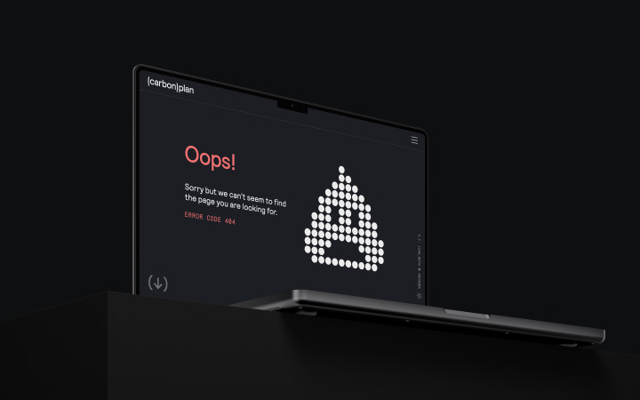
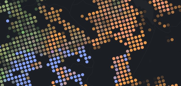
The circle motif reappears to form a dot-based grid system for use in infographics, as well as another embodiment of CarbonPlan’s cheeky side: a set of custom emojis.
