Yore
Yore
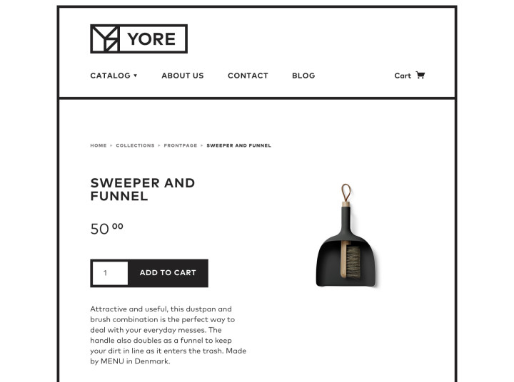
Yore is a Colorado-based retailer providing a thoughtfully curated selection of goods that are quality made, well designed, responsibly manufactured, and practical. We developed a sensible and subtly playful brand identity for use in both digital and physical storefronts.
Scope
Brand Identity, Illustration, Web Design, Web Development
01
Brand Identity
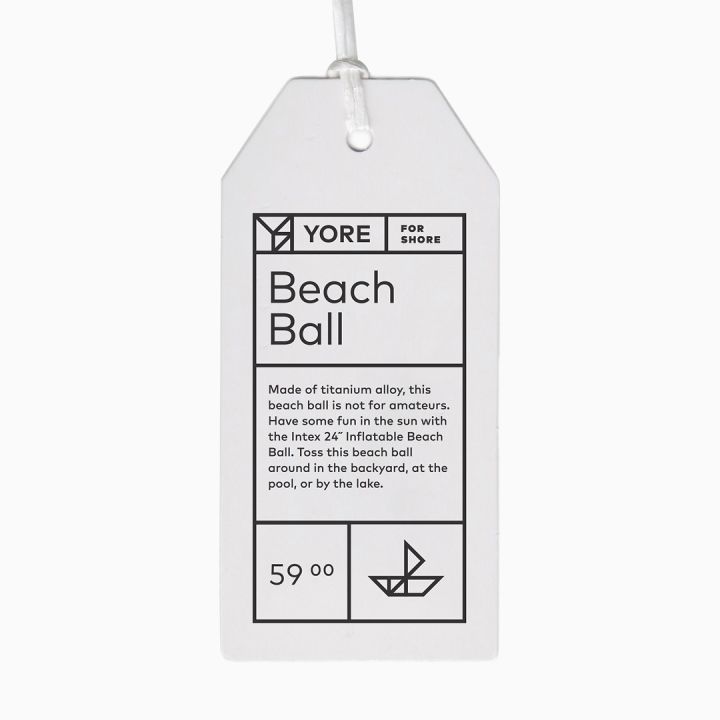
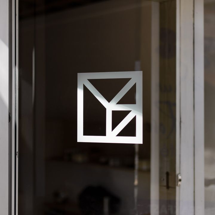
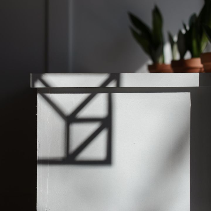
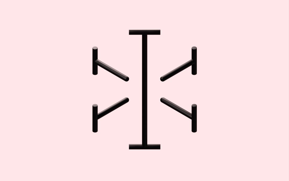
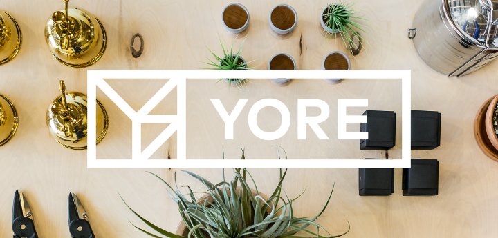
Our strategy for the Yore symbol stemmed from the timeless functionality of tool storage and organization systems. We drew the symbol using a grid based on the standard pegboard pattern. The angled lines in the symbol allude to the braces of garage shelving. In order to provide underlying rationale and uniqueness, the lines in the symbol form each letter of their name. In the application of the identity, borders and boxes reference the gridded modularity of tool chests.

02
Illustration System
Inspired by the tangram puzzle, we developed an illustration system based on using only the individual shapes present in the Yore symbol. This restriction lends a tight integration between the illustrations and the branding system as a whole while intrinsically resulting in unique solutions.


03
Brand In Use
