Vision Ridge Partners
Vision Ridge Partners
An impact investment firm focusing on infrastructure and natural resources, Vision Ridge Partners accelerates financial support to sectors including renewable energy and EV charging networks. We created a new brand identity system to better match their prestigious reputation in the sustainable investment space.
Scope
Brand Identity, Collateral Design, Illustration, Motion Graphics, Print Design, Web Design, Web DevelopmentCool Points
Impact Investing, Eco Print Production01
Identity
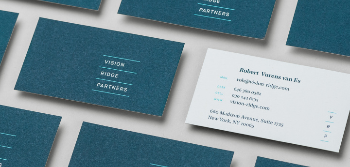
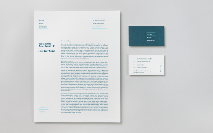
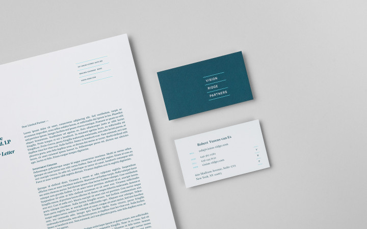
The name Vision Ridge implies a perspective that rises above and can see further into the future, which correlates to their forward-thinking and innovative approach. We embraced that idea in a nuanced way by establishing a vertical ladder of divider bars for the logotype. The linework extends beyond the logo to become a prominent part of layout and occasional graphic imagery.
The color scheme is designed to feel luminous and crisp, referencing a brighter future. For the typography, we paired an uppercase sans serif with a distinctive, modern serif to strike a balance between traditional and contemporary.



Sustainability
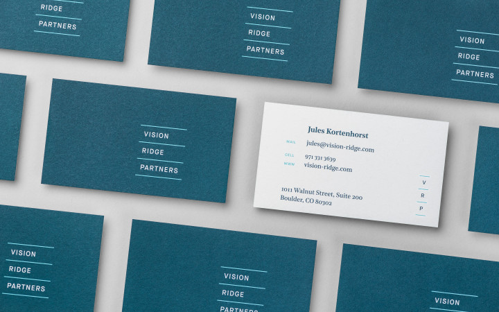
The Vision Ridge Partners business cards use a beautifully textured 100% postconsumer recycled cover stock. The paper is uncoated (which is best for recyclability) and manufactured in the United States. The production was done locally using inks that are 70% vegetable-based and contain extremely low VOC content (less than 1%).
Business Cards Business Cards
Mohawk Paper, Options – Vellum (100% PC White, 130# Double Thick Cover)
100% postconsumer waste (PCW) recycled fibers
Process Chlorine Free (PCF)
Manufactured carbon neutral (RECs certified by Green-e®)
FSC® Certified (Forest Stewardship Council™)
Manufactured in the USA
Offset printed with Toyo Hyplus 100, low-VOC (less than 1%), vegetable-based inks (70% biorenewable content)
02
Website
The subtle motifs of rising, growth, and illumination were applied to the website design, most successfully through the use of animation. The site’s landing page features a mountainous landscape and rising sun which utilize a consistent line weight derived from the logo. When selected, the navigation icon (hamburger menu) expands to match the spacing of the primary logo on the opposite edge of the screen. The subtle line details are carried throughout the site, unifying and strengthening the design.


