Cafe Che
Cafe Che
There’s no doubt about it, everyone loves llamas. And when you’re a restaurant with a demographic composed primarily of teenagers, a silly looking, spit hawking, long-necked mascot is definitely an asset—an absurd tagline is just the icing on the cake.
Scope
Brand Identity, Collateral Design, Signage, Web Design, Web Development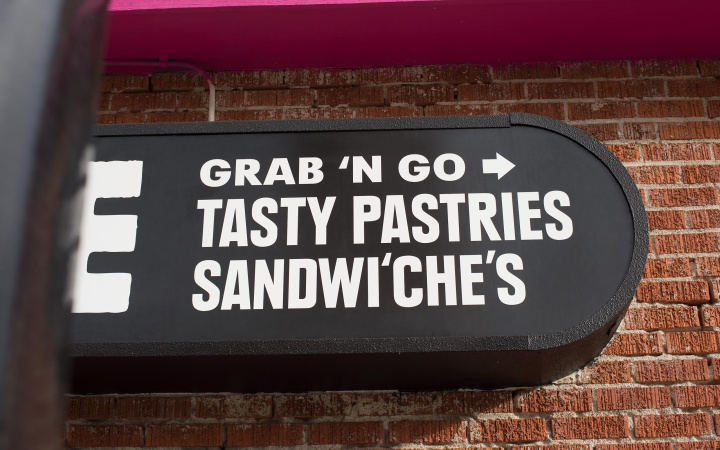
01
Brand Identity
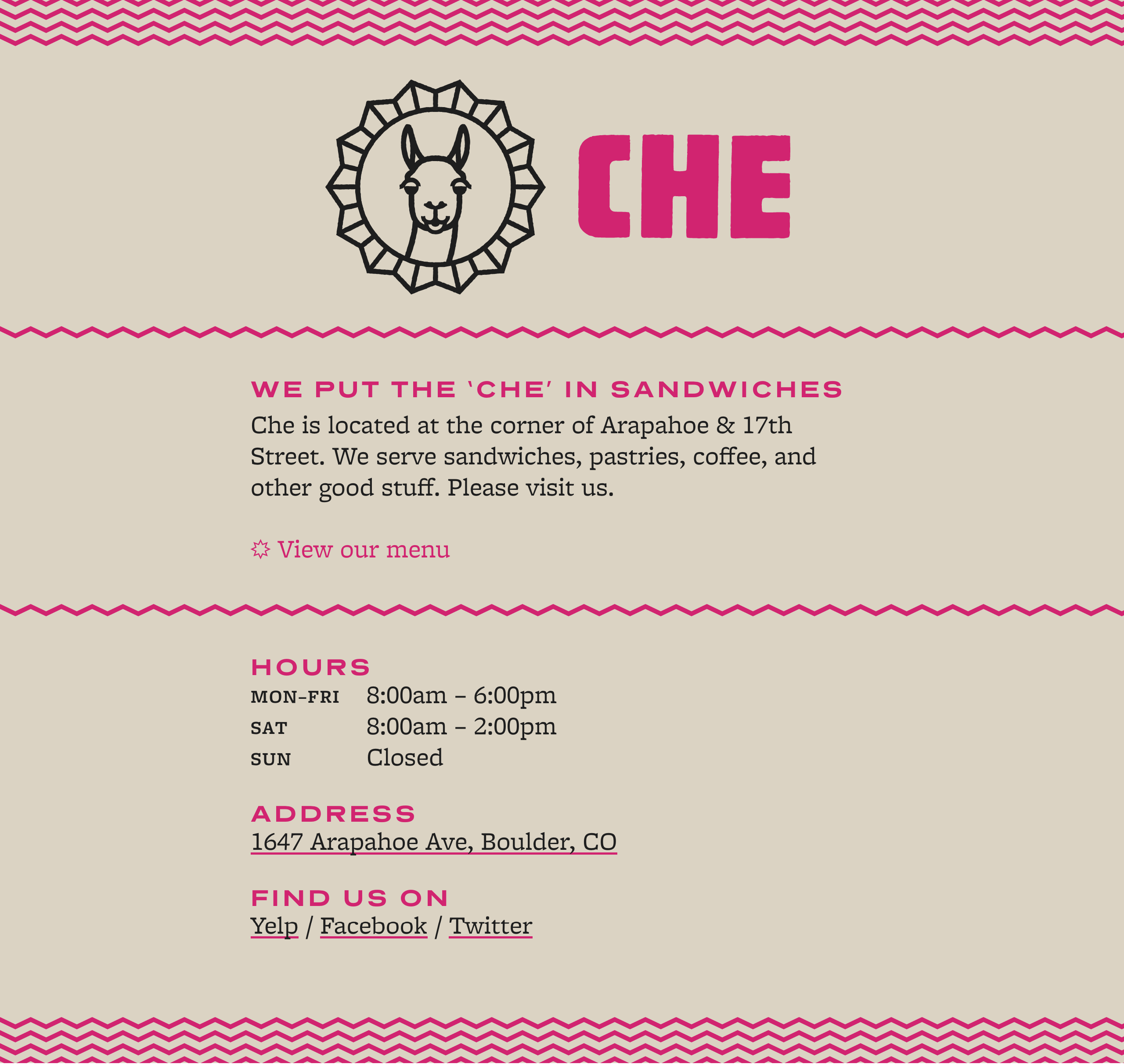
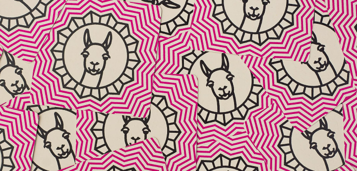
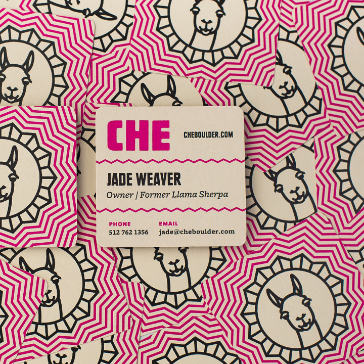
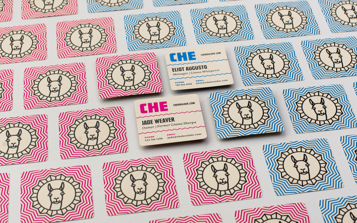
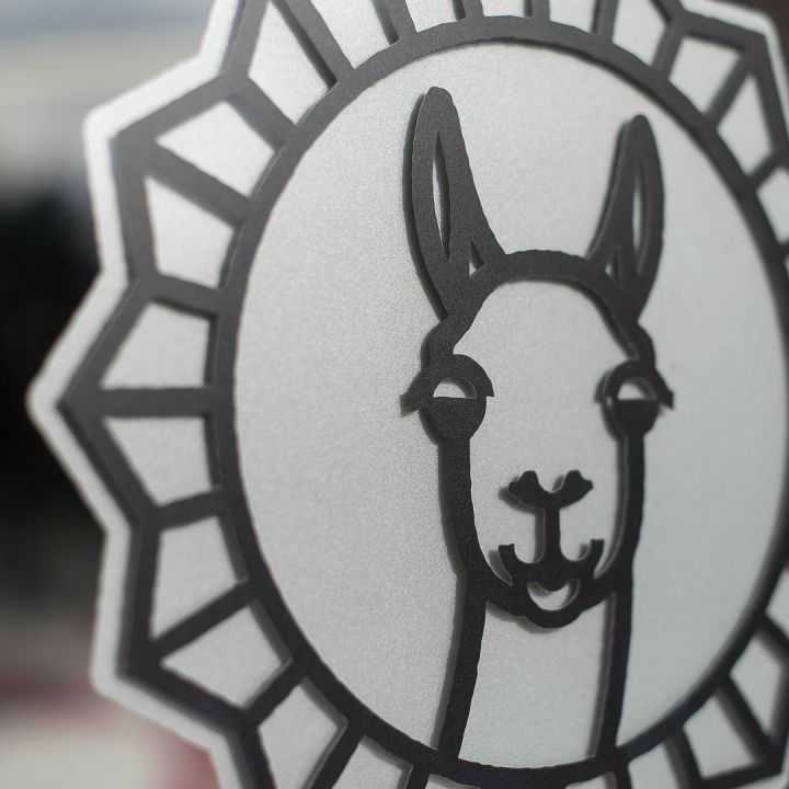
The word “Che” is used as “pal” or “friend” in Argentina, which is where the cafe received its namesake. Creating an identity that is playful, bright, silly, and fun was a part of a conscious decision to distance the cafe from connotations with the historical figure Che Guevara. The llama, common in Argentina, is the focal point of the identity and immediately sets the tone for what visitors should expect. The prominent use of magenta increases the distinctiveness—and, as a result, recognition—of the identity, and the use of a simple geometric pattern references the locale the restaurant’s food is inspired by.

Sustainability
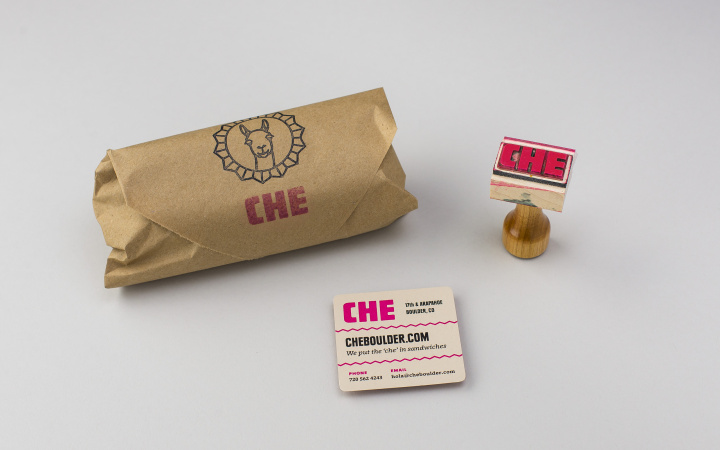
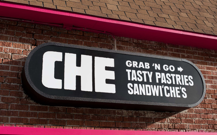
Instead of creating a new sign, we utilized the existing sign structures and panels (left by the building’s previous tenants) by reclaiming the panels and applying new vinyl lettering. This solution reduced the materials used and also resulted in significant cost savings.
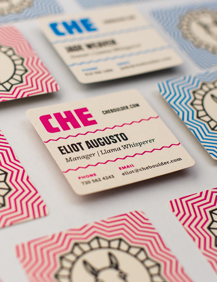
Business Card Business Card
French Paper Co. Durotone (Newsprint Aged, 80# Cover)
100% recycled fibers (30% postconsumer, 70% preconsumer)
Process Chlorine Free (PCF)
Manufactured carbon neutral (with on-site hydroelectricity)
Manufactured in Michigan, USA
Digitally printed with dry toner
Exterior Sign Exterior Sign
Reclaimed sign panels
02
Signage
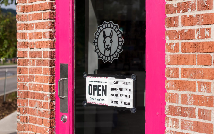
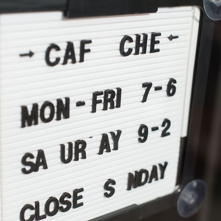
As a new restaurant in a high-traffic area, it was imperative for Cafe Che to instantly identify itself to passers-by. We chose to utilize the sign for both identification and informational purposes, prominently displaying the cafe’s primary offerings in order to pique the interest of nearby drivers and pedestrians.
03
Copywriting
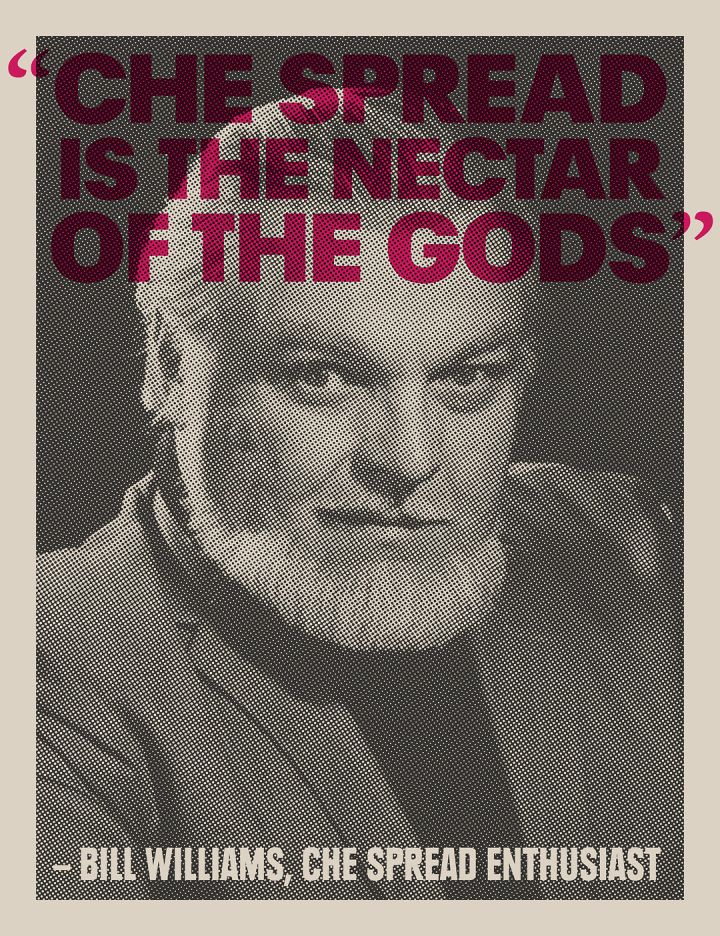
The owner of Cafe Che is an eccentric to say the least. He brings his enthusiasm and personality to every aspect of the cafe. We were given full creative freedom to pursue whatever avenues we thought were appropriate, which included the adoption of the world’s best “worst” tagline. The copy and graphics reflect the zaniness and peculiar sense of humor present throughout the cafe.



04
Website
Mirroring the easy, grab-and-go style of the cafe, the Cafe Che website also remains extremely simple. We added a hypnotizing animation to give it a touch of playful charm.
